


This is the first sig i have ever made so hopefully you like it.
[https://imgur.com/a/44WBmhU
[https://imgur.com/a/44WBmhU
![[Image: RzvXFps.gif]](https://i.imgur.com/RzvXFps.gif)
[OPTION]Height: 6' 3"
![[Image: S4_BANNER_2.png]](https://media.discordapp.net/attachments/901294203663966238/901295745896955904/S4_BANNER_2.png)
 Season 48
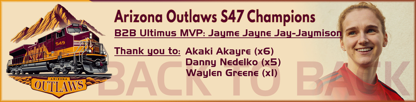
|
This is the first sig i have ever made so hopefully you like it.
[https://imgur.com/a/44WBmhU [OPTION]Height: 6' 3"
2.5/5 550k I gave you a bonus for it being your first sig, and you have a good understanding of what you need to do. However, various elements need some refinement.
Composition: You usually don't want things square in the middle. You can, but in this case (with all that empty space), I think you could either move it over off center or enlarge the render to where the head is somewhat cut off from the top. I also think you could have blended the render and background more. It feels more like the render is sitting on top of the background instead of being a cohesive piece. Render: Your render is high quality, but it lacks a swap and the cut needs to be refined (see around the players right arm). Background: I like the split paint look you have going for it, but I also find the wood's color and the white splotches draw the eye away from the render. Perhaps a darker color or black overlay on low opacity? Text: I like the idea of the text and how it repeats itself in the purple. Very nice touch. It is also very easy to read. That said, I think you should have varied up the font some and perhaps added some texture to it as well. It is also stacked a tad oddly, meaning it could have been made more compact. |
|
|

![[Image: image0.jpg]](https://cdn.discordapp.com/attachments/631152096246366208/654051089494310923/image0.jpg)


![[Image: 58742_v.png]](https://signavatar.com/58742_v.png)
![[Image: 58742_s.png]](https://signavatar.com/58742_s.png)
![[Image: IMG_4308.jpg]](https://cdn.discordapp.com/attachments/773268613532221452/929252111747801139/IMG_4308.jpg)
